Gut the Flow
Research-Driven Branding and Digital Presence Design for a Nutrition Consulting Business
Role
Brand Designer · UX Designer
Duration
6 months
industry
Healthy Lifestyle & Nutrition Consulting
Focus Areas
Brand Identity · Research · Web Design · Social Media
Overview
Gut the Flow is a nutrition consulting startup for which I designed a complete brand identity and digital presence. The goal of the project was not only to create a visual identity but also to build a brand that authentically represents the company’s philosophy and stands out in a highly saturated market.
The branding process was informed by competitor analysis, stakeholder workshops, and interviews with potential customers. The outcome included a new brand name, a complete visual identity system, a website, and foundational social media assets.
Challenge
The market for lifestyle coaching and nutrition consulting services is highly competitive. At the start of the project, the business already had an initial name and logo, but neither effectively supported the desired positioning.
The challenge was to create a brand that could appeal simultaneously to adults seeking lifestyle changes, athletes, and parents who take a conscious approach to their children's nutrition, while offering a more authentic and approachable alternative to the often generic communication styles found in the health and wellness industry.


The old logo and the new logo
Research & Insights
Competitor Analysis
I analyzed both local and international nutrition consulting brands, including NutriAnna, Czakó Dóri, and Claire P. Thomas. The research revealed that most competitors relied on similar visual approaches: green color palettes, stock photography, and highly professional or clinical tones of voice.
User Interviews
We conducted semi-structured interviews with six potential clients. I actively participated in both creating the interview guide and conducting the interviews. The research clearly showed that the biggest obstacle for people was not a lack of information, but maintaining motivation over the long term.
Key Insights
Users are looking for sustainable change rather than quick fixes.
Human and approachable communication is just as important as professional credibility.
Gradual progress is more motivating than radical promises.
Simple and transparent processes increase trust.
Small challenges and visual feedback help maintain long-term engagement

Research notes
Building the Brand Identity
Based on the research findings, we positioned the brand around the concept of sustainable lifestyle transformation. Rather than focusing on weight loss or performance, the communication centered on gradual progress and personalized support.
As part of the branding process, a new name was created: Gut the Flow. The name references both nutrition and the idea that meaningful change is an ongoing process. The core brand values became sustainability, authenticity, personal growth, and human-centeredness.
The visual identity was built around natural green tones, energetic grapefruit-inspired accents, and organic shapes. The goal was to create a visual language that moves away from the sterile aesthetics often associated with healthcare and nutrition services.

Moodboard

Logo iterations
Design
After finalizing the brand positioning, I designed the logo, typography system, and supporting visual assets. The logo was the result of a lengthy iterative process focused on visually expressing movement, progress, and the concept of “flow.”
The website was built in Wix Studio. Both the information architecture and content structure were directly informed by the research findings, with particular emphasis on intuitive navigation and a clear sign-up journey.

Logo evolution
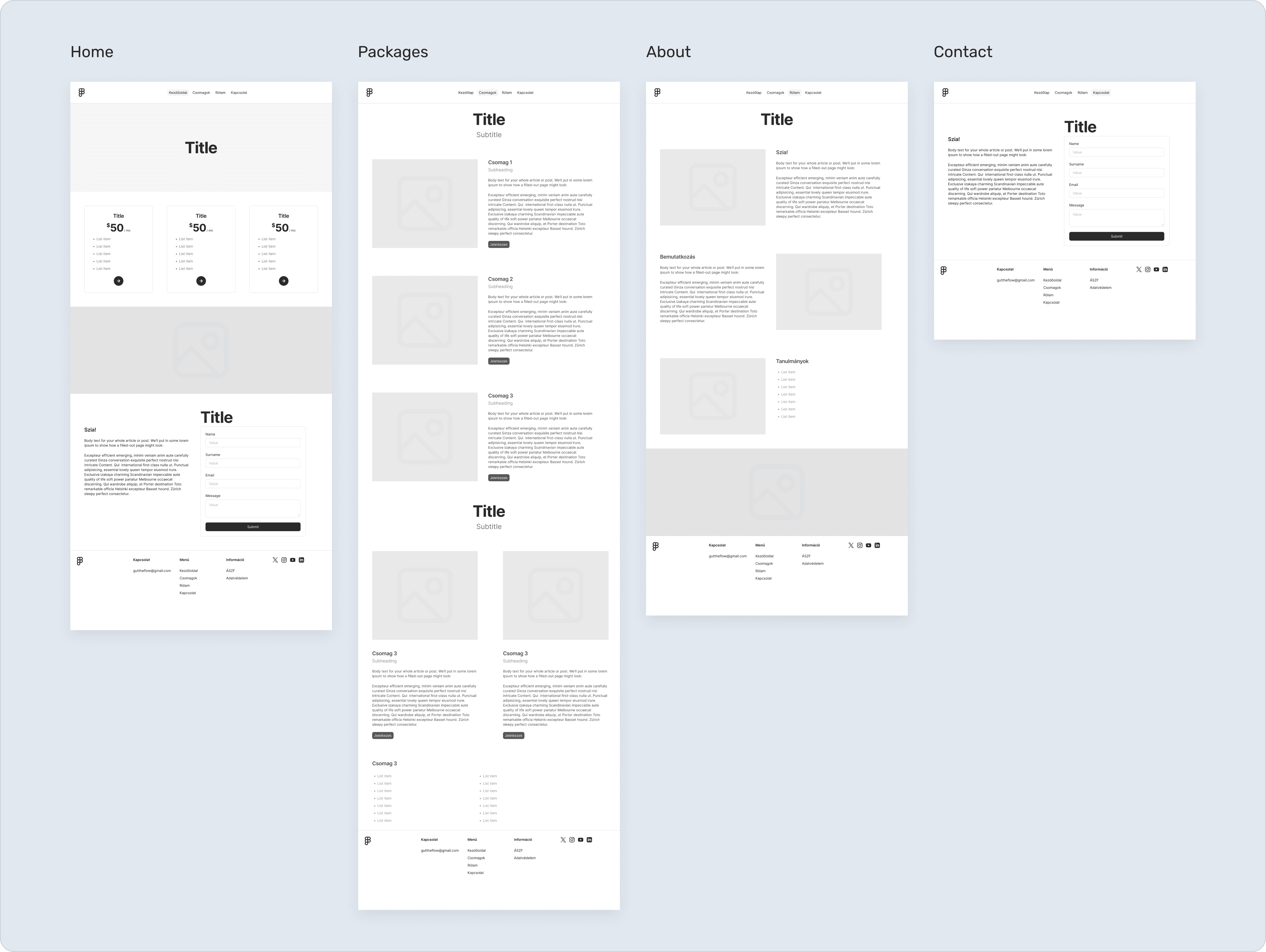
Wireframes
Solution
The final deliverables included:
Complete brand identity system
Logo and visual assets
Responsive website for desktop and mobile
Social media template system
Email and document templates
Brand guidelines
The resulting system provides a consistent experience across all digital touchpoints, ensuring brand coherence and scalability for future growth.

Brandboard
Results
The brand and website are live and operating in a real business environment, making this more than a conceptual project. During usability testing, participants responded particularly positively to the visual identity, illustrations, logo, and overall clarity of the website. Based on the feedback, I refined several navigation and sign-up flow elements.
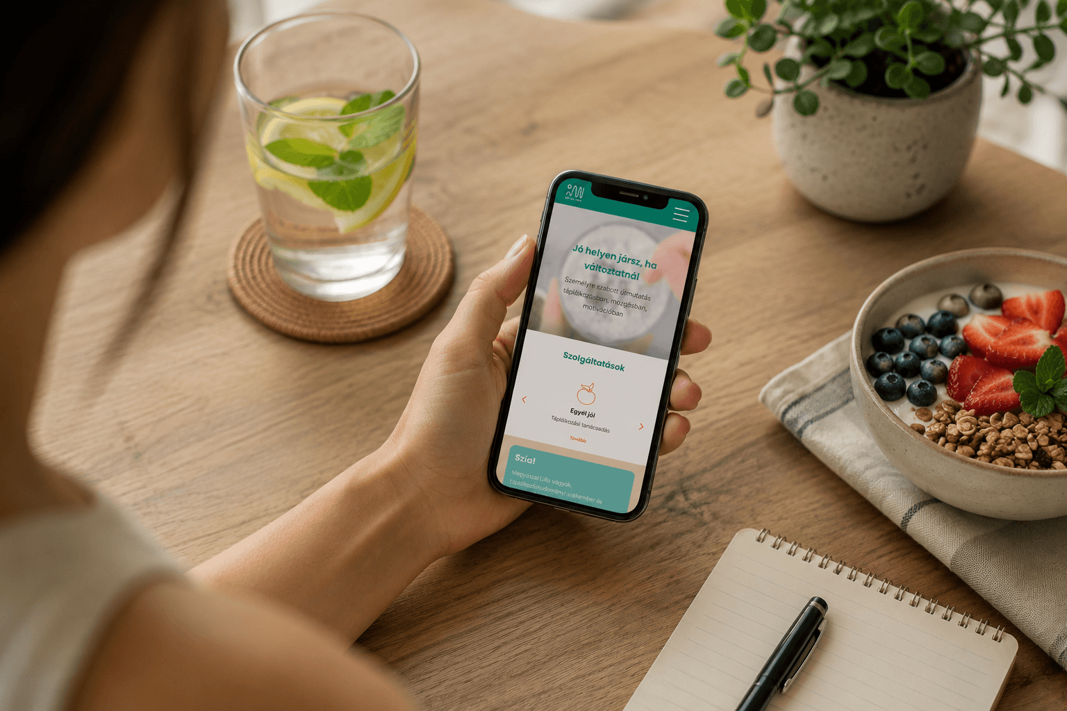
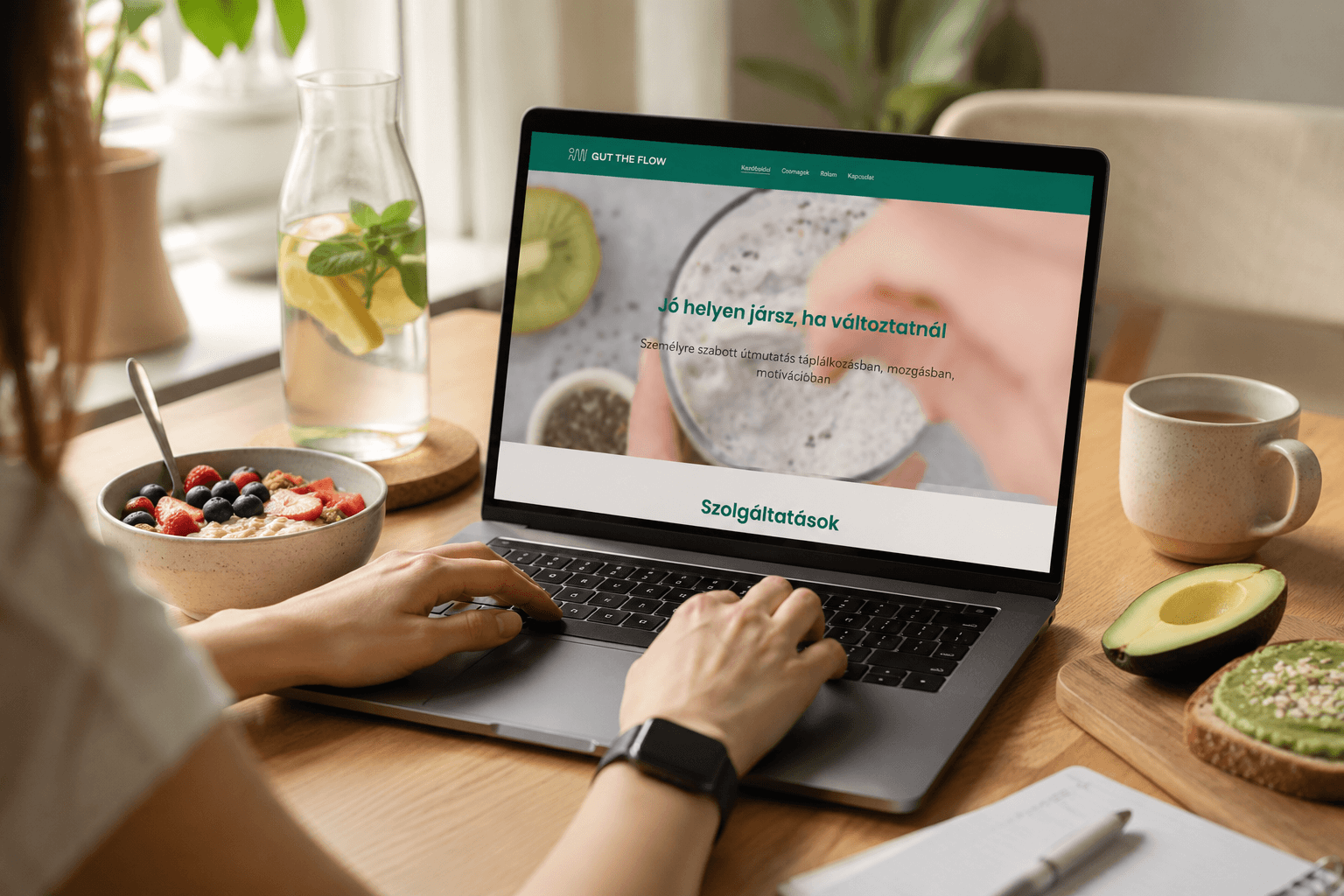
Final layout mockups
Learnings
This project reinforced my belief that branding and UX design overlap far more than they initially appear to. The most impactful decisions were not made during visual design, but during the research, positioning, and communication strategy phases.
User interviews and usability testing significantly shaped the final outcome and once again demonstrated that research-driven thinking can create tangible value in branding projects as well.
